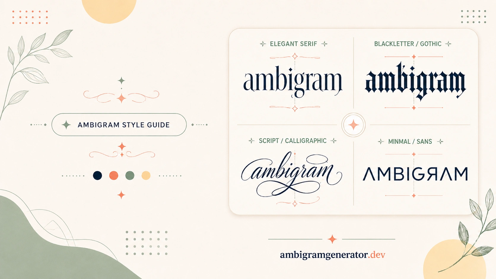
Once you have a word that is ready to become an ambigram, the next decision is often the one people underestimate: which font or lettering style to actually use. It is tempting to think any bold, stylish typeface will do the job, but ambigrams are not regular design work. The letters have to hold up under rotation or reflection, not just look good sitting still. The right font can turn a decent concept into a clean, effortless flip. The wrong one can make even a naturally symmetrical word look awkward.
This guide walks through what actually matters when picking a font or lettering style for an ambigram, how different styles behave once you flip them, and how to match a style to what you are actually making, whether that is a tattoo, a logo, or a piece of decorative word art.
Why Font Choice Matters More in Ambigrams Than in Regular Text
In normal typography, a font just needs to be readable and fit the tone of a project. In ambigram design, the font is doing double duty. Every letterform also has to work as a building block for a second, flipped version of itself, so the choice affects legibility in both directions, not just one.
Where Font Choice Can Make or Break the Flip
A few places where this shows up most clearly:
- Thin, delicate strokes can disappear or blur together once a word is rotated 180 degrees
- Overly decorative serifs or flourishes often clash instead of lining up cleanly
- Letters with unusual proportions can throw off the visual balance a flip depends on
- Highly geometric fonts sometimes read cleaner upside down than expressive, handwritten ones
None of this means decorative or script fonts are off the table. It just means they need to be chosen with the flip in mind, not picked purely for how they look in a straight line.
Key Lettering Traits to Look For
Before worrying about a specific font name, it helps to know what qualities actually support good symmetry. These traits matter more than any single style label.
Stroke Weight and Consistency
Letters with a fairly even stroke weight tend to flip more cleanly than fonts with dramatic thick-and-thin contrast. When one part of a letter is much heavier than another, that imbalance can carry over awkwardly once the word is rotated.
Letter Proportions and X-Height
Fonts where lowercase letters share a similar height and width tend to be easier to work with. Big swings in proportion, like a font with very tall ascenders next to very short letters, can make it harder for two different characters to blend into one shared shape.
Serif vs Sans-Serif vs Script
Each of these broad families brings something different to the table:
- Sans-serif fonts are usually the most forgiving starting point, since clean, simple strokes are easier to rotate or mirror
- Serif fonts can work well but need extra attention, since the small details at the ends of strokes have to line up on both reads
- Script and handwritten styles look distinctive but are the most demanding, since flowing connections between letters do not always survive a flip
Font Styles Compared for Ambigram Use
Here is a quick side-by-side look at how common lettering categories tend to behave once symmetry enters the picture.
| Style | Flip-Friendliness | Best Used For | Watch Out For |
| Sans-serif | High | First-time designs, logos, clean word art | Can feel plain without added styling |
| Serif | Medium | Formal or classic-looking pieces | Fine details need to align on both reads |
| Script / cursive | Lower | Personal, expressive pieces | Connecting strokes often need heavy adjustment |
| Bold display | Medium to High | Tattoos, statement pieces | Too much weight can blur fine symmetry |
| Geometric / blocky | High | Logos, initials, modern branding | Can look rigid if the word is meant to feel soft |
No single row here is the “correct” answer. It is more about matching flip-friendliness with the feeling you actually want the final piece to have.
Choosing a Style Based on Purpose
The best lettering style often depends less on personal taste alone and more on where the ambigram is going to live.
Tattoo Ambigrams
Tattoos need to hold up over time, on skin, at a fixed size, so clarity usually wins over intricate detail. Bolder, simpler strokes tend to age better than delicate scriptwork, which can blur as ink settles. If you are exploring this route, our tattoo ambigram generator is built specifically around styles that tend to work well on skin.
Logo and Brand Ambigrams
Logos need to be recognizable at a glance and often at very small sizes. Clean, geometric, or sans-serif based lettering usually reads better here than something ornate, since a brand mark has to work on a business card just as well as it does on a storefront sign.
Decorative Word Art
If the goal is a framed piece, a gift, or something purely visual, there is more room to experiment. Script or hybrid styles can add personality, as long as you are willing to test a few variations before settling on one.
Common Lettering Mistakes to Avoid
Even with a naturally symmetrical word, a font choice can still work against you. Some patterns worth avoiding:
- Choosing a font purely because it looks good right-side up, without ever previewing the flipped version
- Mixing too many stylistic flourishes into a single word, which can compete with the symmetry instead of supporting it
- Ignoring spacing, since letters that are too tight or too loose can throw off how the whole word balances once flipped
- Assuming a font that worked for one word will automatically work for a different one, even if the letters look similar at a glance
Testing Fonts Before You Commit
Because so much of this comes down to how a style behaves once flipped, rather than how it looks in isolation, testing matters more than theory. A few habits that help:
- Preview more than one style before deciding, since the difference between two similar fonts can be more noticeable after the flip
- Compare a rotational version and a mirrored version of the same word, since a style that struggles with one can work fine with the other
- Try the word at the size it will actually be used, especially for tattoos or small logo marks
- Save a couple of strong options rather than committing to the very first result
If you want to see how different letter shapes come together in finished pieces, the ambigram examples gallery is a useful place to browse before choosing your own direction. And if you are still early in the process, our guide on how to make an ambigram covers the steps that come before and after font selection.
Frequently Asked Questions
Does the font really matter if my word is already symmetrical?
Yes. Even naturally symmetrical words, like palindromes or words with repeated letters, can look uneven if the font has inconsistent stroke weight or awkward proportions. A good structural word still benefits from a font that supports the flip.
What is the easiest type of font to start with?
Simple sans-serif or geometric styles tend to be the most forgiving for beginners, since clean, even strokes are easier to rotate or mirror without extra adjustment.
Are script fonts a bad choice for ambigrams?
Not necessarily, but they take more work. Flowing, connected letters can look beautiful but often need extra styling to hold together once flipped, so they are usually better suited to designs where you can test several variations first.
Should tattoo ambigrams use a different style than logo ambigrams?
Often yes. Tattoos tend to favor bolder, simpler strokes that stay clear over time, while logos usually lean toward clean, geometric lettering that reads well at small sizes.
How do I know if a font is working before I finalize a design?
The best way is to preview the flipped or mirrored version directly rather than guessing from the straight-on text. Comparing a few styles side by side makes it much easier to spot which one holds up.
Final Thoughts
Choosing a font for an ambigram is really about choosing how much support your letters need to pull off the flip. Clean, consistent styles tend to make the process easier, while decorative or expressive styles can still work beautifully, as long as you are willing to test, compare, and adjust. There is no single best font for every word or every project. The right choice depends on your word, your purpose, and how much revision you are willing to do to get there.
The fastest way to find out what works is simply to try a few styles and see how they hold up once flipped.