
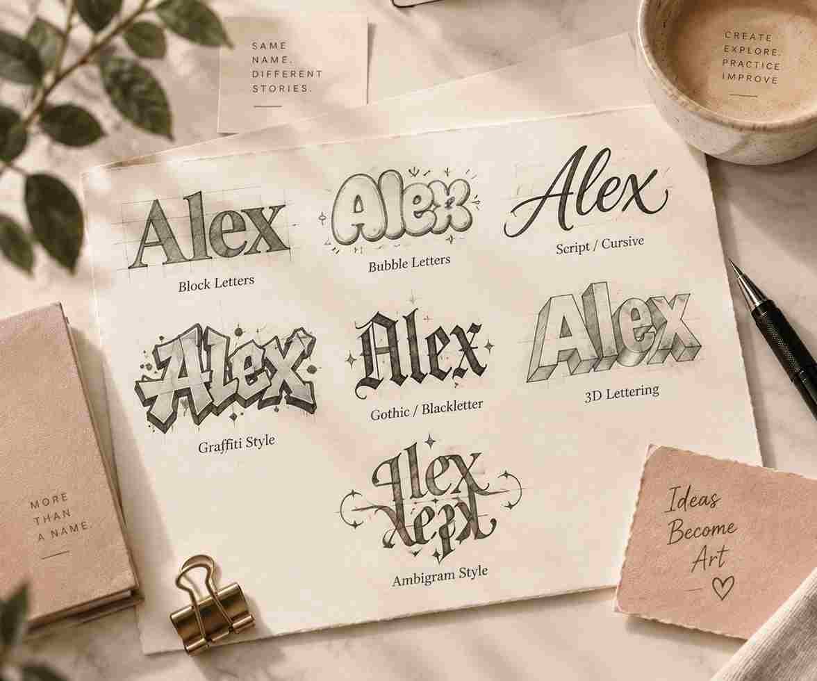
How to Draw Names in Different Styles
There’s something satisfying about seeing your own name, or someone else’s, turned into a piece of art instead of just plain handwriting.How to Draw Names in Different Styles? Whether it’s for a journal cover, a birthday card, a tattoo idea, a bedroom door sign, or just doodling in the margins of a notebook during a boring class, drawing a name in a fresh style makes it feel personal in a way that typing it on a screen never quite does. It turns something ordinary into something that looks like it took actual effort and thought.
The good news is you don’t need to be a trained artist to start, and you definitely don’t need years of art school behind you. Most name lettering styles are built from the same handful of basic shapes, straight lines, curves, and angles, just arranged, stretched, and weighted differently depending on the look you’re going for. Once you understand a few core techniques and get comfortable sketching them slowly, switching between very different looking styles becomes a lot easier than it seems the first time you try.
This guide walks through some of the most popular styles for drawing names, a few practical tips to make your first attempts look cleaner and more finished, and answers to the questions people usually ask when they’re just starting out and not sure where to begin.
Start
Designing
in Seconds
Create stylish ambigram designs for names, tattoos, words and logo ideas.
Before You Start Drawing
Pick a Style That Fits the Mood
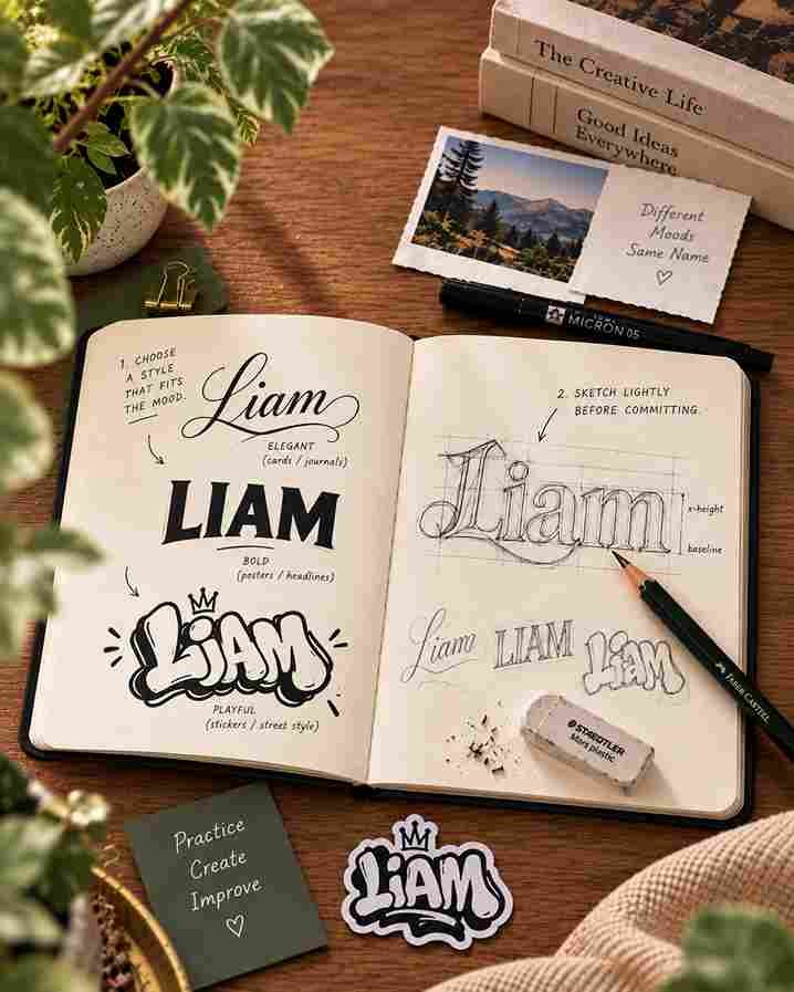
Not every style suits every purpose, so it helps to think about where the name is actually going before you decide how to draw it. A soft flowing cursive script feels right for a wedding card, a baby announcement, or a page in a personal journal, while bold block letters or a graffiti style look far more at home on a poster, a skateboard, or the side of a sneaker. Matching the style to the mood of the project saves you from getting halfway through a design and realising it doesn’t fit the occasion at all, which is a frustrating way to lose an hour of work.
Sketch Lightly Before You Commit
Almost every good name design starts life as a rough, messy pencil sketch, not a clean finished line. Lightly block out where each letter is going to sit, how tall it needs to be compared to the others, and how much horizontal space the whole name will realistically take up before you start adding any detail or going over anything in pen. This step feels slow and a little unnecessary at first, especially when you’re excited to just start drawing, but it’s exactly what stops the last letter of a name from getting awkwardly squeezed into a tiny leftover corner because the first few letters ended up taking more room than planned.
Try Your Tattoo Word
Popular Styles for Drawing Names
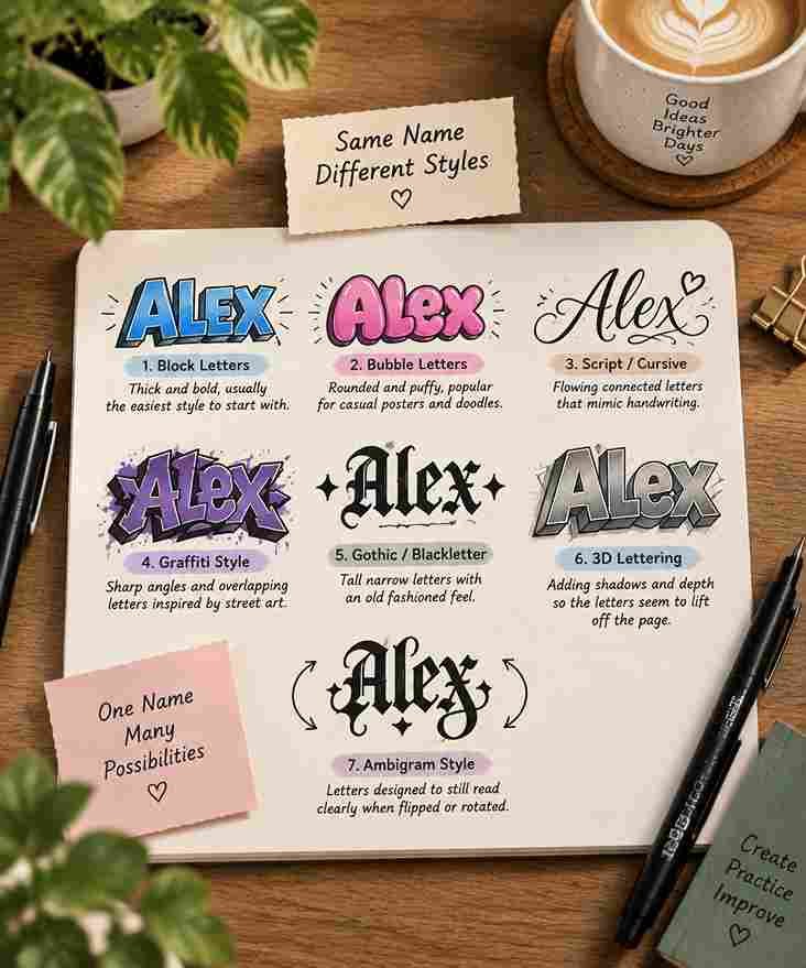
- Block letters, thick and bold, usually the easiest style to start with
- Bubble letters, rounded and puffy, popular for casual posters and doodles
- Script or cursive style, flowing connected letters that mimic handwriting
- Graffiti style, sharp angles and overlapping letters inspired by street art
- Gothic or blackletter, tall narrow letters with an old fashioned feel
- 3D lettering, adding shadows and depth so the letters seem to lift off the page
- Ambigram style, letters designed to still read clearly when flipped or rotated
Tips That Make Any Style Look Better
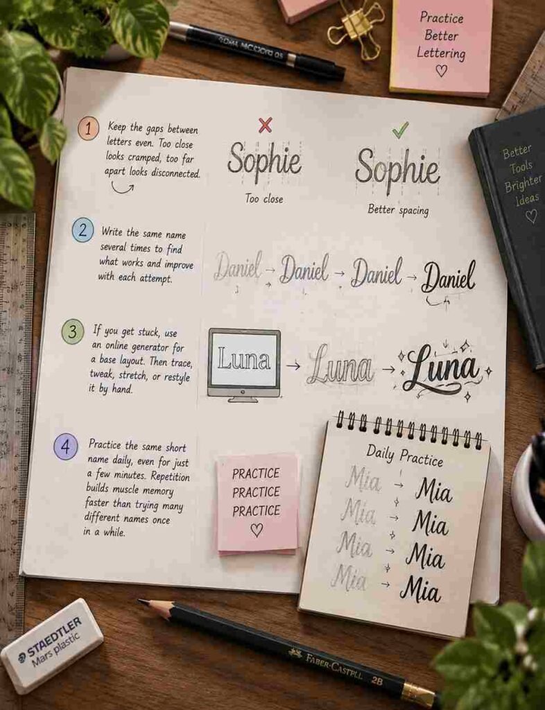
Spacing matters more than most beginners expect, and it’s usually the difference between a design that looks intentional and one that looks rushed. Letters that are packed too close together start to blur into each other and feel cramped, while letters spaced too far apart begin to look like separate little words rather than one single name. Keeping the gaps between letters roughly even, even when the letters themselves vary quite a bit in width, is one of the fastest ways to make an otherwise simple design look far more polished and deliberate.
It also helps enormously to practice the same name several times in a row rather than jumping to a brand new name every single attempt. Repetition lets you actually notice which specific curves or joins felt awkward on the page, then adjust and try again on the very next round while it’s still fresh. If you ever get stuck or just want a starting point, tools like online generators can hand you a solid base layout that you then trace over, tweak, stretch, or restyle by hand instead of having to build every single letter from a completely blank page.
Frequently Asked Questions
The quick answers most people are looking for.
What's the easiest style to start with as a beginner?
Block letters are usually the friendliest place to begin, since they’re built from simple straight lines and sharp corners rather than the smooth, continuously connected strokes that script or cursive style demands from the very first letter.
Do I need special tools to draw names in different styles?
Not really, and that’s part of what makes this such an accessible hobby. A pencil, an eraser, and any regular pen are enough to get started and produce something you’ll be happy with. Fine liners or brush pens help later once you want noticeably cleaner outlines or thicker, more expressive strokes, but they aren’t necessary for your very first attempts.
How do I keep my letters looking consistent?
Sketching light pencil guidelines for height and spacing before you draw each individual letter is by far the biggest help here. It keeps every letter roughly the same size relative to the others and stops the whole name from slowly drifting upward or downward as you work your way across the page.
What's the difference between calligraphy and lettering?
Calligraphy is writing done in one continuous flowing motion, usually with a specific pen or brush designed to vary the line thickness as you move. Lettering, on the other hand, is drawing letters piece by piece almost like illustrating them, building up each shape slowly, which is exactly why it tends to be easier for beginners to control and correct along the way.
Can I turn my name into an ambigram?
Yes, and it’s one of the more rewarding styles to eventually try once you’re comfortable with the basics. It does take noticeably more planning than other styles, since every letter needs to work convincingly in two directions at once, but starting with an online ambigram generator can give you a solid base design to study, adjust, and refine by hand.
How can I practice drawing names faster?
Repeating the same short name or word daily, even for just a few focused minutes, builds muscle memory far faster than only practicing an occasional long list of completely different names once in a while.